Pictograms
Pictograms represent data.
Example

Amy the cat likes eating salmon pouches.
How many pouches did she eat over a week?
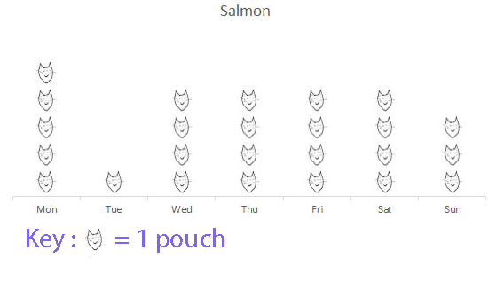
Amy ate a total of 25 salmon pouches.
Bar charts, line graphs, pie charts, scattergraphs, boxplots and more
Pictograms represent data.
Amy the cat likes eating salmon pouches.
How many pouches did she eat over a week?
Amy ate a total of 25 salmon pouches.
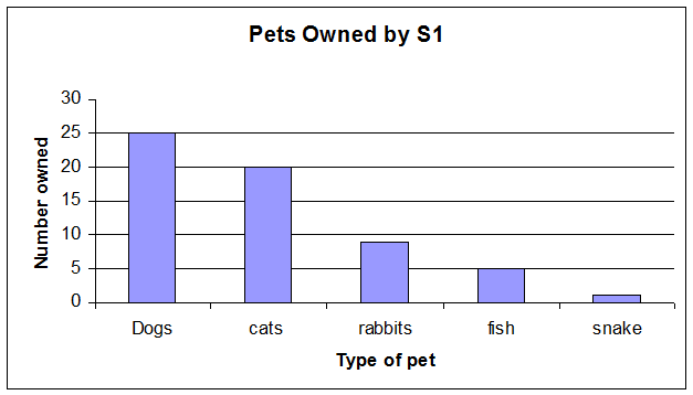
A bar chart is a way of visually representing categorical data.
The higher the bar , the greater the number of items in that category.
Bar charts have gaps between the categories.
Example of a bar chart
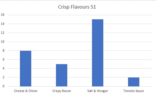
An S1 class was asked to vote for their favourite crisps from a selection of flavours.
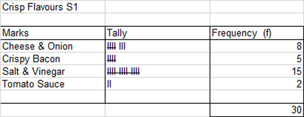
The bar chart shows that the order of preference was Salt and Vinegar, then Cheese and Onion , Crispy Bacon and Tomato Sauce.
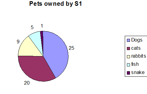
Example of a pie chart
Line graphs can be used to form a numerical relationship for the information between the categories.
To make a line graph, plot each point with a dot, then join the dots with a straight line.
Always use a ruler!
Data for rainfall for a location measured over one year:

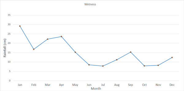
The graph shows that the location was wetter in the first four months of the year than the rest of the year, with July being the driest month.
A stem and leaf diagram allows data to be recorded quickly, and for simple statistics to be found.
The data is cut into levels, which form the stem, and leaves.
A key is needed to decode the diagram.
A stem and leaf diagram must have:
Here, EL = 34% and EU = 86%.
EL is at level 3 and EU is at level 8.
Number of Levels = Level of EU − Level of EL + 1
Here, number of levels for the stem is 8 − 3 + 1 = 6.
Use tens for the stem and units for the leaves.
Put the data in order!
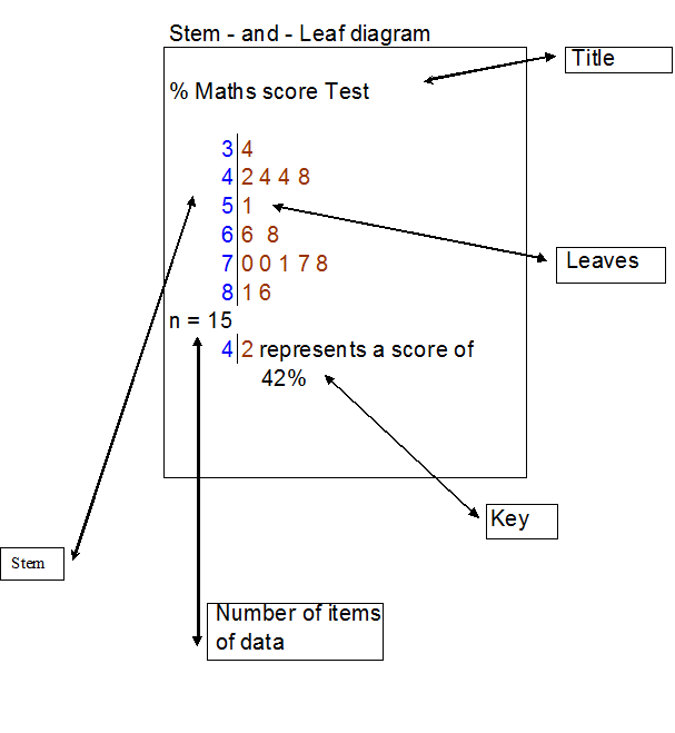
From the diagram, it can be seen that the median score is 68% and that the modal group is the seventies percentage range, since five people got a score between 70 and 78%.
If the pass mark was 50%, it can be seen that 10/15 or 2/3 of the pupils passed the test.
Sometimes, two sets of data must be recorded and compared. A back‑to‑back stem and leaf diagram helps quick comparison.
This time, the stem is in the centre, with the leaves as data to either side.
The first set of data is read as normal, from centre to right.
The second set of data is read backwards from centre to left.
Put the data in order!
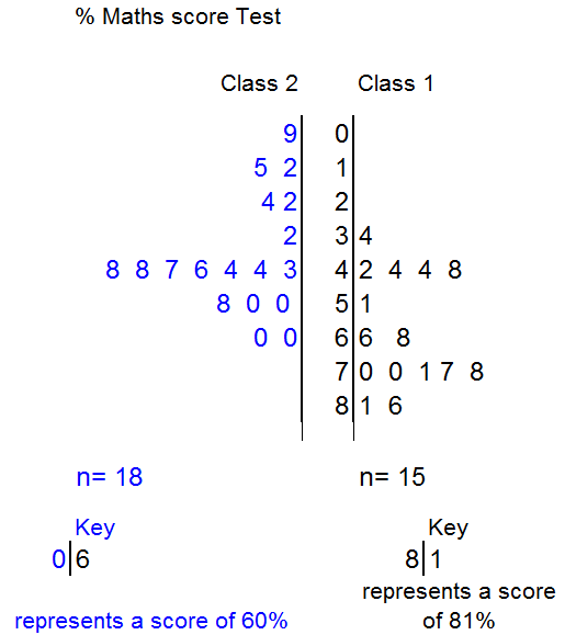
From the diagram, it can be seen that the median score for class 2 is 45% and that the modal group is the forties percentage range, since seven people got a score between 43 and 48%.
The lowest score for class 2 is 9%, the highest is 60%.
If the pass mark was 50%, it can be seen that class 1 did far better than class 2.
A dot plot lets you see how the data is spread. A dot is placed for each piece of data. The mode can be seen quickly.
A dot plot must have:
Pulse rate of patients attending clinic
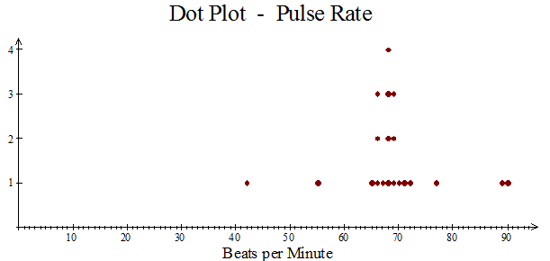
The mode is 68.
Most of the data lies between 65 and 72 beats per minute.
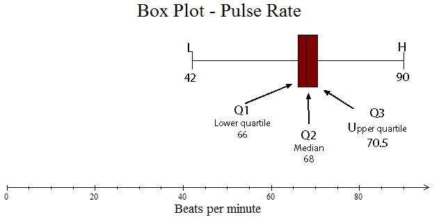
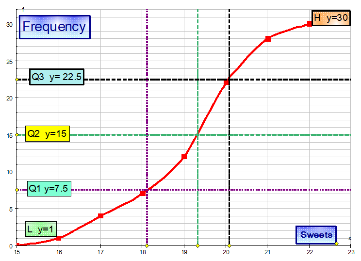
A box plot also lets you see how the data is spread.
It is formed from a 5‑figure summary.
A box is drawn around Q1, Q2 and Q3, with tails going out to L and H.
A box plot must have:
Pulse rate of patients attending clinic
Scatter graph: Positive correlation
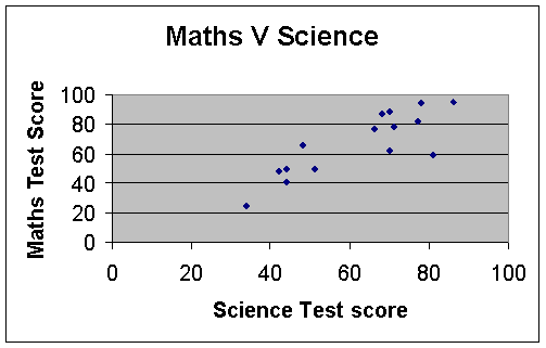
This is positive, since the data rises from left to right.
Scatter graph: Negative correlation
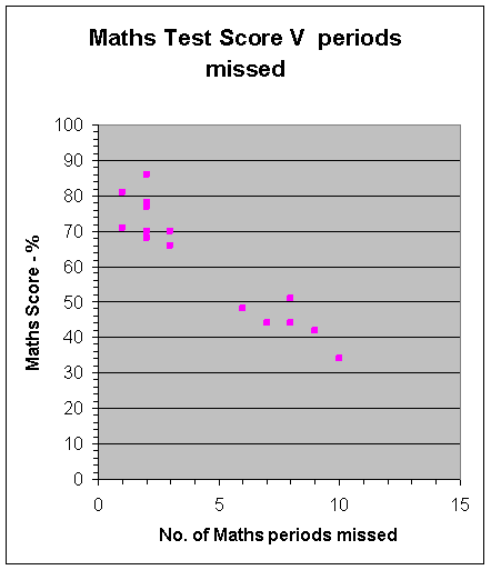
This is negative, since the data drops from left to right.
The more maths missed — the lower your score!
Scatter graph: No correlation
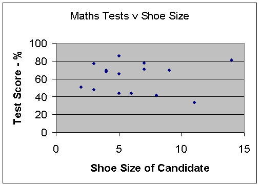
There is no correlation, since the data is spread out in the middle.
Your maths score does not depend on your shoe size!
This allows empirical data to be plotted. A straight line is then drawn which tries to go through as many of the data points as possible — but has an equal number of points above and below the line.
In science classes, the mean of the data is often plotted and used as a point on the line.
Once the line has been drawn and extended back to the y‑axis, the gradient can then be calculated.
The equation of the line can then be calculated using y = mx + c.
This equation can then be used to make predictions.
Test scores for an S4 maths and physics test are shown below:

a) Is there a correlation between scoring well in maths and physics?
b) Draw a line of best fit and estimate the physics score for someone who scored 30 for maths.
c) Use your line of best fit to find an equation linking the physics and maths test results.
d) Use your equation to predict the physics score for a pupil who scored 80 in maths.
Solution
Data is plotted on a scatter graph.
The mean of the data (62, 64) has also been plotted as a purple dot.
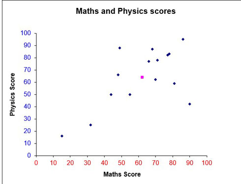
a) From the graph, a positive correlation exists since the data slopes upwards from left to right. Scoring well in Physics suggests scoring well in Maths.
A line of best fit is added, trying to take in as many points as possible, going through the mean and leaving an equal amount above and below the line.
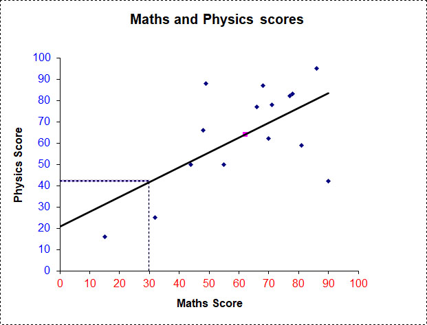
b) A dotted line is drawn up from 30 on the x‑axis to the line of best fit. Another dotted line is drawn straight across to the y‑axis.
A person scoring 30 for maths will score approximately 42 for physics.
c) Taking two points on the line of best fit gives the gradient:
\[ \begin{aligned} m &= \frac{y_2 - y_1}{x_2 - x_1} \\[6pt] &= \frac{64 - 42}{62 - 30} \\[6pt] &= \frac{22}{32} \\[6pt] &= \frac{11}{16} \\[6pt] &= 0.6875 \end{aligned} \]The y‑intercept is read off the graph (approximately 21).
The equation is:
y = 11/16 x + 21
So physics score is approximately 11/16 of the maths score, plus 21.
d)
\[ \begin{aligned} y &= \frac{11}{16}x + 21 \\[8pt] \text{when } x &= 80 \\[8pt] y &= \frac{11}{16} \times 80 + 21 \\[8pt] &= 55 + 21 \\[8pt] &= 76 \end{aligned} \]A pupil with a maths score of 55 has a predicted physics score of 76.
Cumulative frequency is used to show the running total.
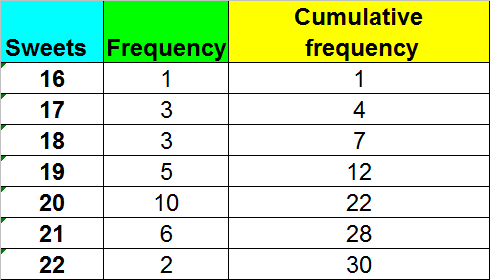
A cumulative frequency diagram, or ogive, is an S‑shaped plot.
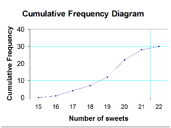
It is useful for finding the quartiles.
Use the y‑axis scale to find where the quartiles should be, then read across to where the line touches the curve. Read off the corresponding x‑value.
From the diagram: Q2 = 19.2 (approx), Q1 = 18.1 (approx), Q3 = 20.1 (approx)
This gives an SIQR of approximately 1, which shows that the data does not vary hugely.
Also known as the Bell Curve or Gaussian Curve.
This is a symmetrical graph centred on the mean of the data.
The x‑axis shows data values, the y‑axis shows the relative probability of the data values occurring.
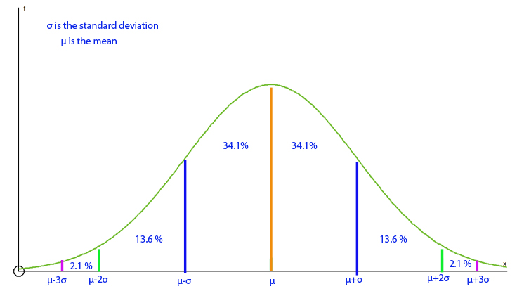
68–95–99.7 rule: Approximately 68% of the data lies within 1 standard deviation of the mean, 95% within 2 standard deviations, and 99.7% within 3 standard deviations.
The taller the peak, the smaller the standard deviation.
Example
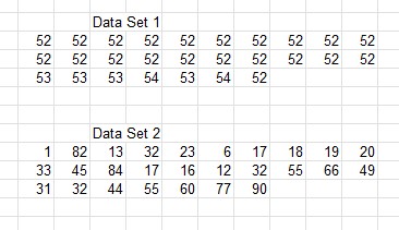
Data Set 1 has values that are very close together and do not vary much from the mean (μ), giving a low variance (σ²) and low standard deviation (σ).
Data Set 1: μ = 52.3 (1 d.p.), σ² = 0.4 (1 d.p.), σ = 0.6 (1 d.p.)
Data Set 2 has values that are widely spread, giving a high standard deviation.
Data Set 2: μ = 38.1 (1 d.p.), σ² = 625.2 (1 d.p.), σ = 25.0 (1 d.p.)
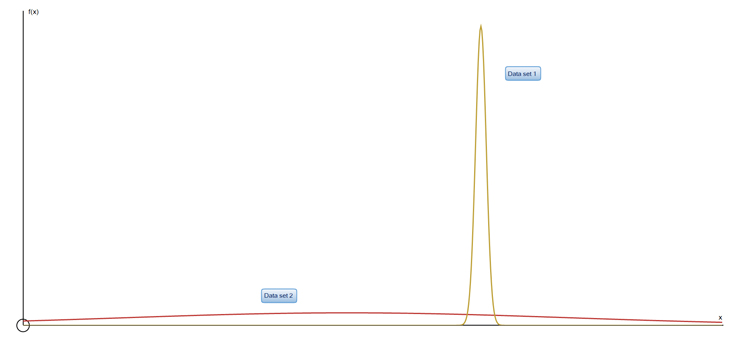
Data Set 1 clearly has a taller peak and therefore a lower standard deviation than Data Set 2.