Basic statistical terms
Types of data
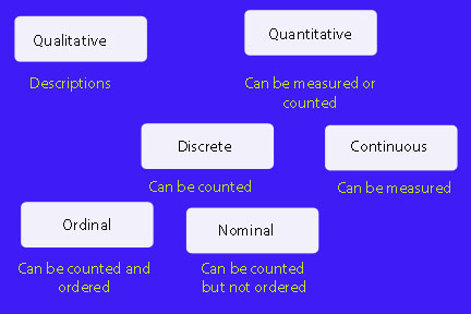
Qualitative data
This is data which describes something categorical, e.g. "He is tall", "She has blue eyes"
Quantitative data
This is data which can be counted in numbers. It can be either continuous or discrete.
Continuous data
This is data which can be measured,
Examples
Length of hair , amount of rainfall in June.
Continuous data can fall any where within the data range.
Line graphs can be used to form a numerical relationship for the information between the categories.
To make a line graph, plot each point with a dot, then join the dots with a straight line.
Always use a ruler !
Example
Data for rain fall for a location measured over one year :-

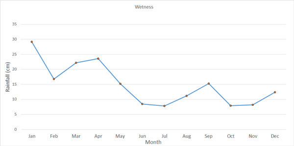
The graph shows that the location was wetter in the first four months of the year than the rest of the year, with July being the driest month.
Discrete data
This is data which can be counted, e.g. number of legs, number of sunny days in June.
Discrete data is restricted to certain values, often whole numbers.
Discrete data can be ordinal or nominal
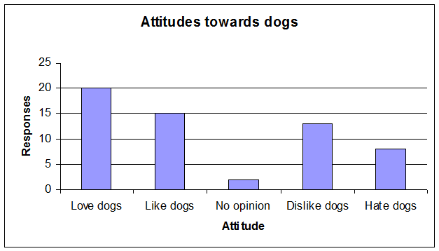
Ordinal data
(Ordered category data)
This is data which has categories which can be counted and ordered.
Example
The following bar chart shows the responses to the question "How much do you like dogs?"
The attitudes can be ordered from Love to Hate, but there is still no way to form a numerical relationship for the information between the categories.
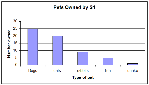
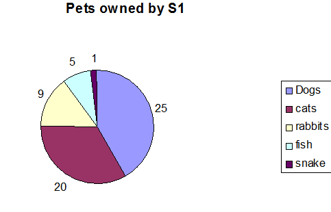
Nominal data:
(Unordered category data) -
This is data which can be counted but not ordered.
Example
Make of Car, Pets owned, flavours of bags of crisps sold.
The data is often displayed by a bar chart, pie chart or pictograph.
This is because a numerical relationship cannot be deduced for the information between the categories.
(E.g. what is halfway between dogs and cats?)
Example of a bar chart
Example of a pie chart
Population
A population is the complete set of persons, values or things for which data is being collected. For example, all dogs in the UK would form the target population for a statistical analysis on dog food preferences.
Census
A census collects data from the whole population.
Sample
A sample collects data from a part of the population.
Batch Size
The batch size is the number of bits of data in the sample. It is given the letter n
Example
n = 15
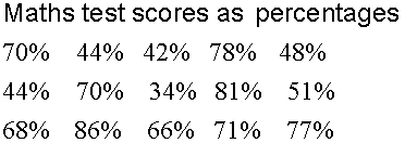
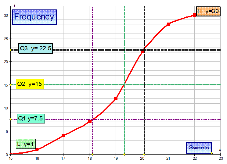
Lower and Upper Extremes
The smallest data value in a batch is called the lower extreme and is given the symbol EL
The largest data value in a batch is called the upper extreme and is given the symbol EU
For the maths test scores data above, EL = 34% and EU = 86%
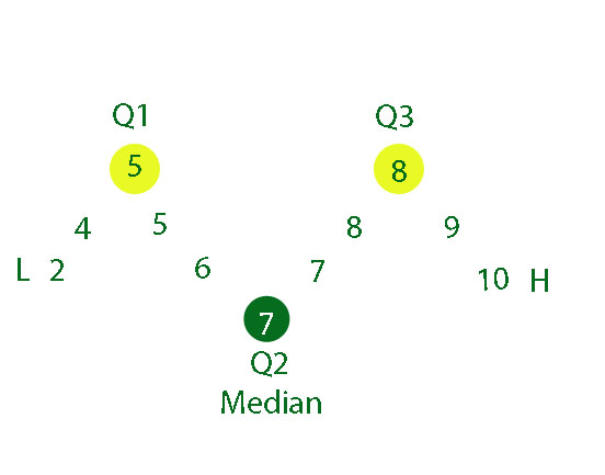
Quartiles
Quartiles cut the data into quarters.
Q1 ( also known as QL ) is the lower quartile. This is the median of the lower half of data.
Q3 ( also known as QU ) is the upper quartile. This is the median of the upper half of data.
Each quartile represents 25%, so 50% of the data is represented between Q1 and Q3.
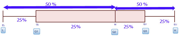
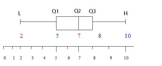
The five-figure summary
- The highest Number H ( also known as EU )
- The lowest Number L ( also known as EL )
- The median, the number which halves the list Q2 ( also known as M)
- The upper quartile, the median of the upper half Q3 ( also known as QU )
- The lower quartile, the median of the lower half Q1 ( also known as QL )
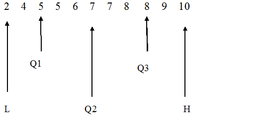
Example
2 4 5 5 6 7 7 8 8 9 10
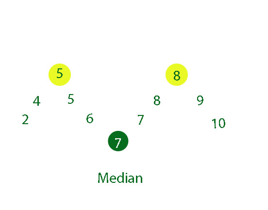
n = 11
This is odd, so calculate 1/2( n+1)
1/2( n+1) = 1/2( 11+1) = 1/2 x 12 = 6
The median is the 6th position, so Q2 = 7
There will be (n-1) /2 numbers in each half.
So there will be 5 numbers in each half.
The lower quartile is the median of the lower half, so Q1 = 5
The upper quartile is the median of the upper half, so Q3 = 8
or
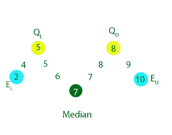
5 -fig summary
H = 10
L = 2
Q1 = 5
Q2 = 7
Q3 = 8
This information can be represented as a box plot :-
Skewness
If the shape of the diagram is almost the same when a horizontal line is drawn across it, then the batch is symmetric.
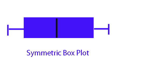
The left hand part is equal to the right hand
or EU - M = M - EL
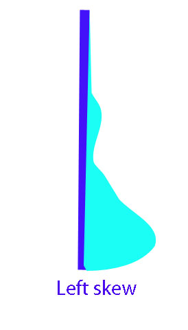
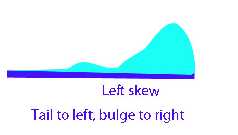
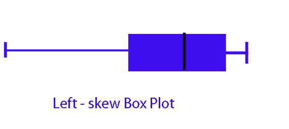
Otherwise, it is skew.
If the smaller values are further apart than the larger values, the batch is left-skew. ( The data will bulge near the bottom)
If the smaller values are closer together than the larger values, the batch is right-skew. (The data will bulge near the top)
The left hand part is longer than the right hand
or EU - M < M - EL

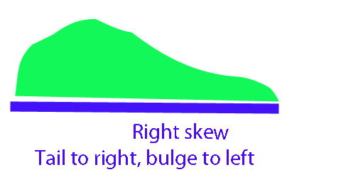
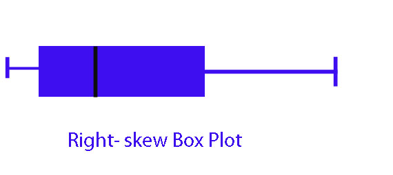
The right hand part is longer than the left hand
or EU - M > M - EL
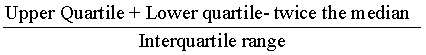
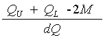
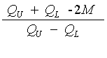
Measure of Skewness based on quartiles
QU = Upper Quartile ( also known as Q3)
QL = Lower Quartile ( also known as Q1)
or
If the result is positive, the data is right-skewed
If the result is negative, the data is left-skewed.
Example
A 5 figure summary of data gives :
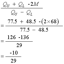
The data is negative so is left-skewed.
Average
There are three commonly used averages, the mean, median and mode.
These are sometimes called measures of location
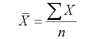
Mean
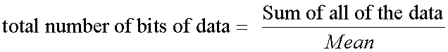
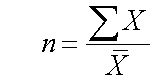
The mean is the sum of the data divided by the number of bits of data.
This is also know as the arithmetical average.
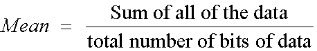
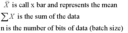
It is represent like this :
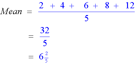
Example
Find the mean of the list
2 , 4 , 6, 8 , 12
The equation can be manipulated
![]()
![]()
and
Example
Find the sum of the list of 8 numbers which has a mean of 18
Sum = mean x n
=18 x 8
=144
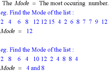
Mode
The mode is thhe most recurring number in a list . Not all lists have a mode
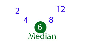
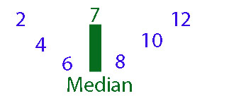
Median
The middle value of an ordered batch of data is called the median.
If there are an odd number of bits of data, the median will be the value at 1/2( n+1) , where n is the batch size
If there are an even number of bits of data, the median will be exactly halfway between the two values at 1/2n , where n is the batch size
Example
Find the median of the list
2 , 6 , 12, 8 , 4
Here, n = 5
This is odd, so calculate 1/2( n+1)
1/2( n+1) = 1/2( 5+1) = 1/2 x 6 = 3
The median is the third number in the ordered list.
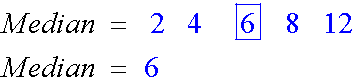
This can be seen if the data is laid out like so :
Example
6, 8 , 10, 2 , 12, 4
Here, n = 6
This is even, so calculate 1/2n
1/2n = 1/2 x 6 = 3
Median will be halfway between the 3rd and 4th numbers in the ordered list.
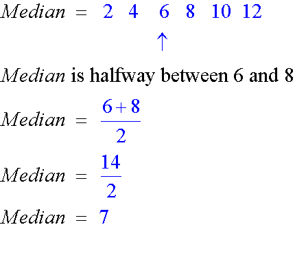
This can be seen if the data is laid out like so :
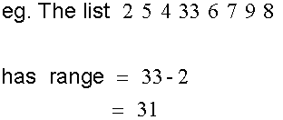
Range
The range is the difference between the highest and lowest numbers.
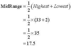
Mid Range
The mid range is halfway between the highest and lowest values.
For the list given above
Spread

When comparing distributions, it is useful to know
- The central trend ( mean , mode or median)
- The spread ( use range or interquartile range or semi-interquartile range)
The spread in statistics - representing the variability or dispersion of a set of data values - measures how far the data points are from the center or the average of the distribution. The further the spread the less consistent the result.
The Interquartile range is the range between the upper and lower quartiles
Interquartile range= Q3 - Q1
The Semi-interquartile range ( SIQR) is half of the interquartile range.
Semi - interquartile range =1/2 (Q3 - Q1)
Example
Compare the two sets of maths results.
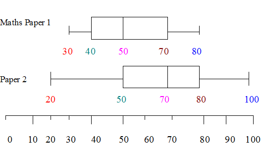
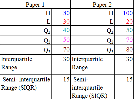
Paper2 has a better score overall, since more than three quarters of the candidates got a score of 50 or more, whereas only 50% of those sitting paper 1 got between 50 and 80%.
Paper 2 has a larger spread of marks and a median of 70% , but both papers have the same inter quartile range.
Charts
Pictograms
Pictograms reprsent data.
Example

Amy cat likes eating salmon pouches
How many pouches did she eat over a week ?
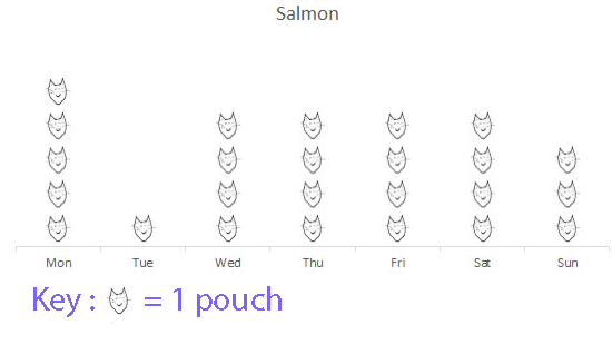
Amy ate a total of 25 salmon pouches .
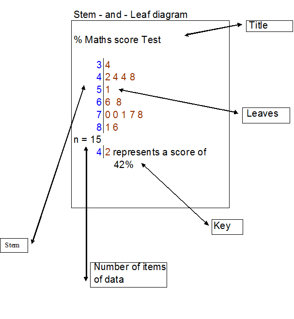
Stem and leaf diagram
A stem and leaf diagram allows data to be recorded quickly, and for simple statistics to be found.
The data is cut into levels, which form the stem, and leaves.
A key is needed to decode the diagram.
A stem and leaf diagram must have
- A Title
- A Key
- The number of items of data ( n)
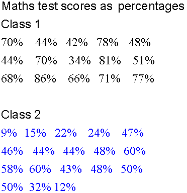
Example
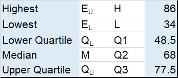
Here, EL =34 % and EU = 86%
EL is at level 3 and EU is at level 8
Number of Levels = Level of EU - Level of EL + 1
Here, Number of levels for the stem is 8 - 3 +1 = 6
Use tens for the stem and units for the leaves.
Put the data in order !
From the diagram, it can be seen that the median score is 68% and that the modal group is the seventies percentage range, since five people got a score between 70 and 78%.
If the pass mark was 50%, it can be seen that 10/15 or 2/3 of the pupils passed the test.
Back to back stem and leaf diagrams
Sometimes, two sets of data must be recorded and compared. A back to back stem and leaf diagram helps quick comparison.
This time, the stem is in the center, with the leaves as data to either side.
The first set of data is read as normal, from center to right.
The second set of data is read backwards from center to left.
Example
Put the data in order !
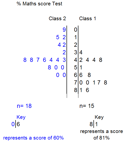
From the diagram, it can be seen that the median score for class 2 is 45% and that the modal group is the forties percentage range, since seven people got a score between 43 and 48%. The lowest score for class2 is 9%, the highest is 60%.
If the pass mark was 50%, it can be seen that class1 did far better than class2.
Dot Plots
A dot plot lets you see how the data is spread. A dot is placed for each piece of data. The Mode can be seen quickly.
A dot plot must have
- A Title
- A Scale
Example
Pulse rate of patients attending clinic
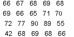
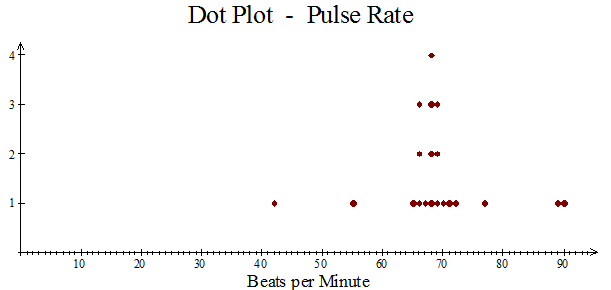
The mode is 68.
Most of the data lies between 65 and 72 beats per minute.
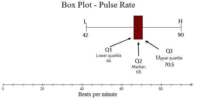
Box Plots
A box plot also lets you see how the data is spread.
It is formed from a 5-figure summary.
A box is drawn around Q1, Q2 and Q3, with tails going out to L and H.
A box plot must have
- A Title
- A Scale
- A box and tails
- Markings and values for L, Q1,Q2,Q3,H
Example
Pulse rate of patients attending clinic
Standard Deviation
This is a measure of how much the data varies from the mean.
![]()
variance is the mean of the squares minus the square of the mean.
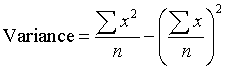
A standard deviation of zero indicates that the data and the mean are effectively the same.
Two formulae are given by the SQA to calculate the standard deviation:
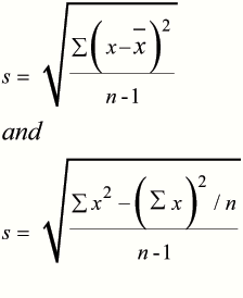
With the first equation:-
- Find the mean by adding the data and dividing by n
- Find the difference between the data and the mean ( x bar)
- Square these differences.
- Add up the total of the squared differences'
- Plug into the first equation given in test paper.
With the second equation:-
- Square the data to get x2
- Find Totals Σ x and Σ x2
- Square the total Σ x and divide by n.
- Plug into second equation given in test paper.
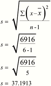
Example
Calculate the standard deviation of
the numbers
101 105
133 142 185 186
First Equation
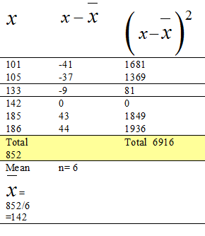
- Find the mean by adding the data and dividing by n
- Find the difference between the data and the mean ( x bar)
- Square these differences.
- Add up the total of the squared differences'
- Plug into the first equation given in test paper.
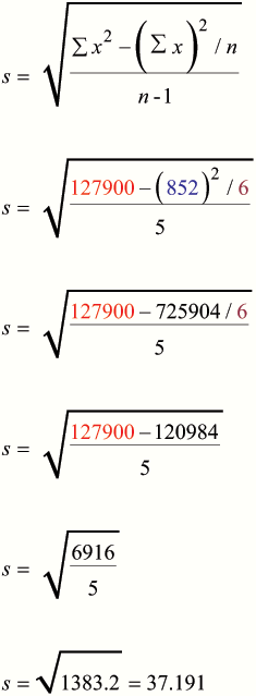
Using equation 2
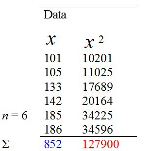
- Square the data to get x2
- Find Totals Σ x and Σ x2
- Square the total Σ x and divide by n.
- Plug into second equation given in test paper.
Changing all of the numbers by the same amount does not affect the standard deviation.
Example
The standard deviation of
101 105 133 142 185 186
Is the same as the standard deviation of
1 5 33 42 85 86
And
4 8 36 45 88 89
Frequency Tables
These are a useful way of collating raw data, to quickly see the mode, find the median and calculate the mean.
Example
A manufacturer claims that each packet of shazbo contains 20 sweets on average.
When 30 packets of Shazbo are examined,the results are as follows :-
No. of sweets per packet
18 17 22 19 20 20 21 19 18 20
21 19 21 19 20 20 20 17 19 21
22 18 17 16 20 20 20 21 21 20
Is the manufacturer correct ?
Construct a frequency table of the data.
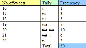
The table shows that the mode of the sample is 20 sweets, which has a frequency of 10.
The median value lies half way between the
15th and 16th values.
The frequency column shows that the first 12 values have between 16 and 19 sweets.The 15th and 16th values have 20 sweets.
The median is therefore 20 sweets.
To calculate the mean , we need to add another column and multiply the frequency by the number of sweets.
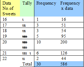
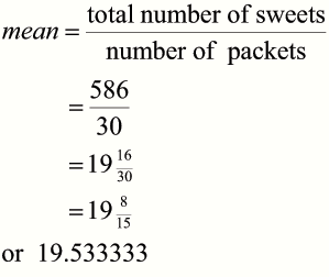
The mean is 19½ sweets,
which could be rounded to 20 sweets.
The manufacturer is correct !!
Cumulative Frequency
Cumulative frequency is used to show the running total.
Example
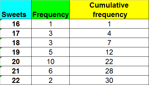
A cumulative frequency diagram, or ogive, is an s shaped plot.
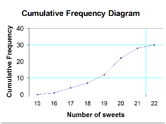
It is useful for finding the quartiles.
Use the y axis scale to find where the quartiles should be, then read across to where the line touches the curve. Read off the corresponding x value.
From the diagram Q2 = 19.2 (approx), Q1 = 18.1 (approx) and Q3 = 20.1 (approx)
This gives an SIQR of 1 (approx) , which shows that the data does not vary hugely.
Grouped Frequency tables and mid point class intervals
These are used when the data is sorted into intervals.
Example
The scores for an S4 homework are shown below as percentages.
Firstly, the data is sorted into equal intervals
- The midpoint is found by adding the end intervals and halving the result
- The frequency is then multiplied by the midpoint
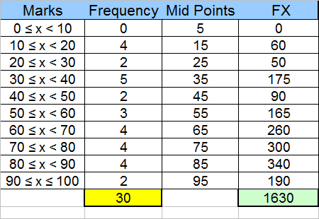
The Modal interval is 30 to 39
The mean is 1630 / 30 = 54.3333
The median is halfway between the 15th and 16th items.
This is found by adding the frequencies and occurs in the interval 51 to 60.
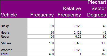
Relative frequency
The relative frequency is a measure of the fraction of the data. It can be used to predict amounts.
To find the relative frequency, divide the frequency for the particular item by the total frequency of the data
The total relative frequency must always be 1..
Example
The following vehicles were sold in Dogland.
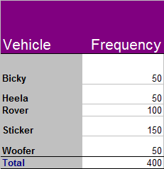
How many Woofers are expected to be sold per 1000 vehicles ?
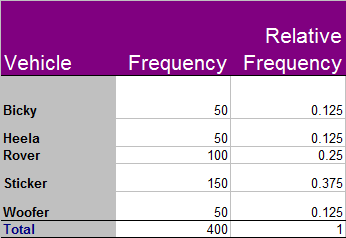
Woofers account for 12.5% of the vehicle sales, so for every 1,000 vehicles sold by the dealer in Dogland, 125 of them would be expected to be a Woofer.
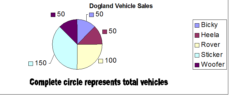
To display the data as a pie chart, calculate the fraction of 360°
Scatter Diagrams
Scatter graph : Positive correlation
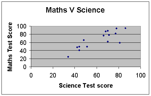
This is positive, since the data rises from left to right.
Scatter graph :Negative correlation
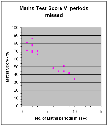
This is negative, since the data drops from left to right.
The more maths missed - the lower your score !
Scatter graph :Negative correlation
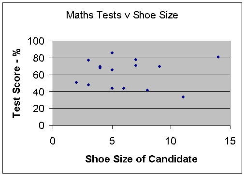
There is no correlation, since the data is spread out in the middle.
Your maths score does not depend on your shoe size!
Line of Best Fit
This allows empirical data to be plotted. A straight line is then drawn , which tries to go through as many of the data points as possible - but has an equal number of points above and below the line.
In science classes, the mean of the data is often plotted and used as a point on the line.
Once the line has been drawn, and extended back to the y axis, the gradient can then be calculated.
The equation of the line can then be calculated, using y=mx +c .
This equation can then be used to make predictions.
Example
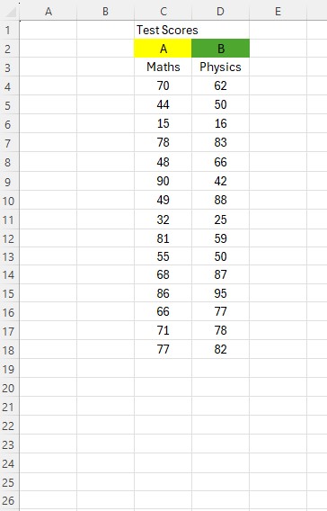
Test scores for an S4 maths and physics test are shown below:-

a) Is there a correlation between scoring well in maths and physics ?
Explain your answer.
b) Draw a line of best fit on the scatter graph and use it to estimate the physics score for someone who scored 30 for maths.
c) Use your line of best fit to find an equation linking the physics and maths test results for this data set.
d) Use your equation to predict the physics test score for a pupil who scored 80 in the maths test.
Solution
Data is plotted on a scatter graph.
The mean of the data (62,64) has also been plotted as a purple dot.
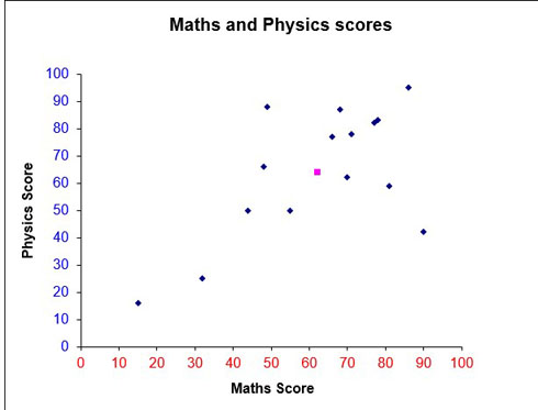
a) From the graph, a positive correlation exists since the data slopes upwards in a line from left to right.Scoring well in Physics suggests scoring well in Maths.
A line of best fit is added, trying to take in as many points as possible, going through the mean and leaving an equal amount above and below the line.
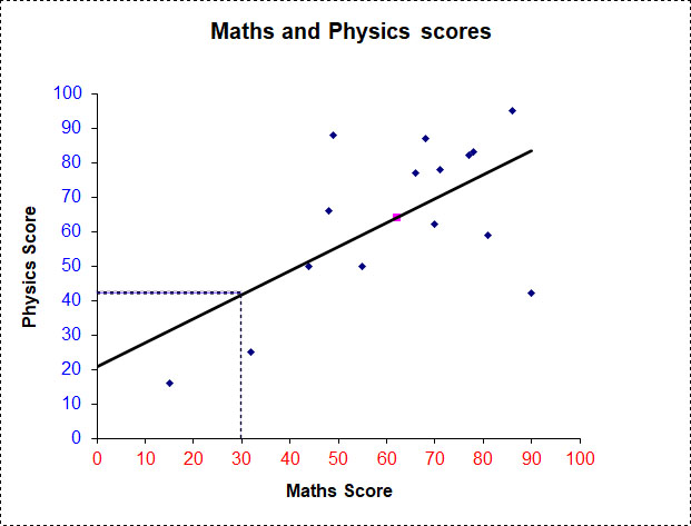
b) A dotted line is drawn up from 30 on the x axis to the line of best fit. Another dotted line is drawn straight across to the y axis.
This figure can now be read off .
A person scoring 30 for maths will score approximately 42 for physics.
c)
Taking two points on the line of best fit gives the gradient :
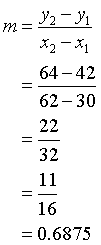
The y -intercept is read off the graph. ( Approximately 21)
The equation is y = 11/16x + 21
so Physics score is approximately 11/16 of the maths score, plus 21
d)
A pupil with a maths score of 55 has a predicted physics score of 76
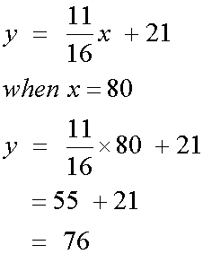
This number, between -1 and 1 ,is commonly used to measure the strength and direction of a relationship.
An r value of 0 means there is no correlation between the variables, r > 0 means a positive correlation, r < 0 means a negative correlation.
If r = 1 or r =-1 , the line of best fit falls exactly on the data.
If r > 0.5 or r < -0.5 , the line of best fit falls close to the data points, giving a strong relationship.
The main equation used is :
Example
Using the data from the line of best fit above :
Write columns for x, x2, y, y2 and xy
Add up each column to get Σx, Σx2,Σy, Σy2 and Σxy
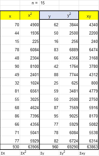
Substitute into the equation and calculate
r = 0.6202
Since r > 0.5, there is a strong, positive relationship between scoring well in maths and physics .
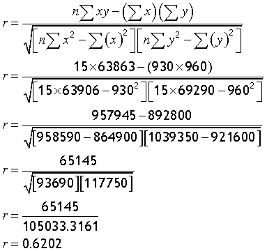
The Excel formula =PEARSON(cellrange x values,cellrange y values) will return the value of r.
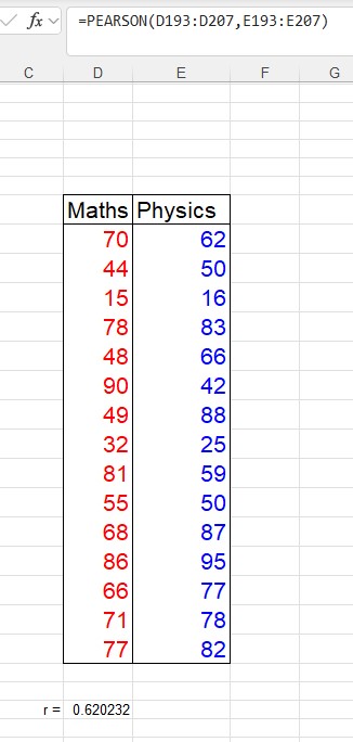
Sticking with the data given above for the maths and physics scores, and using the line of best fit with equation y = 11/16x + 21
How well does the data fit the predicted line ?
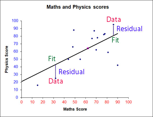
Data = Residual + Fit
The residuals ( or deviations) can be examined to see how good the Fit is.
Plotting the x values against the y residuals for the data above gives
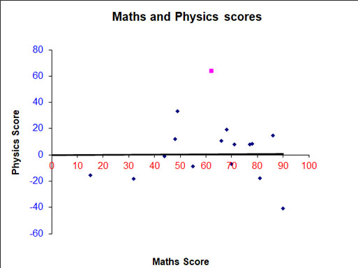
An equal amount of data above and below the lines shows that the line of best fit calculated is not too bad a fit.
Probability
Probability is the chance of something happening.
All probabilities lie between 0 and 1
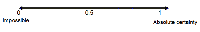
Probability can be written as a fraction, decimal or percentage.
Example
An Even chance can be written as 0.5, 50% or ½
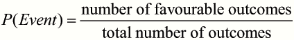
The probability of an event happening is equal to the number of ways an event can happen divided by the total number of possible outcomes.
Example
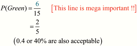
A bag contains 5 blue, 6 green and 4 red counters.
What is the probability that a counter picked at random will be green ?
Example
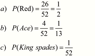
What is the probability that a card picked at random from a standard pack of 52 playing cards will be :-
A red card ?
An Ace ?
The King of Spades ?
Mutually exclusive events cannot happen at the same time.
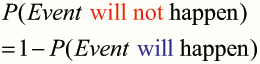
Example
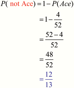
What is the probability that a card picked at random from a standard pack of 52 playing cards will not be an Ace ?
The addition law
This is used to find the probability of two mutually exclusive events to happen.
![]()
Example
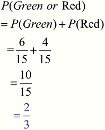
A bag contains 5 blue, 6 green and 4 red counters.
What is the probability that a counter picked at random will be green or red ?
The multiplication law
This is used to find the probability of two totally independent events to happen.
![]()
Example
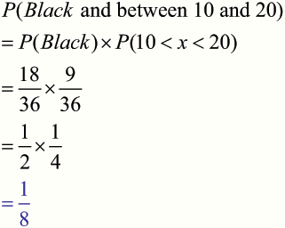
A man is playing a game which involves spinning a wheel.
The wheel has 36 slots, numbered 1 to 36, evenly coloured red or black.
What is the probability that the ball will land on a black number which is between 10 and 20, exclusive ?
Tree diagrams
Probabilities are written on the branches of the diagram and multiplied to give the probability of two events happening.
When there is more than one way of obtaining the desired outcome, the probabilities for each way are added together to find the total probability.
Example
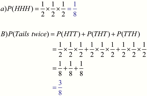
A coin is tossed 3 times.
What is the probability that the coin will land:
heads up all three times ?
tails up twice only ?
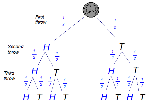
Total Possible outcomes
HHH THH
HHT THT
HTH TTH
HTT TTT
Two way Tables
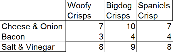
Example
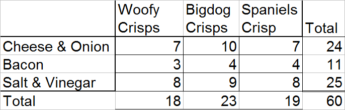
The following table shows the crisps preferences by brand and flavour of 60 people.
Are more of the people likely to choose Cheese and Onion as a flavour than BigDog Crisps as a brand ? Give a reason for your answer.
First, add total columns.
Now work out the probability for each part of the question.
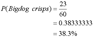
There are a total of 23 Bigdog Crisps chosen out of the 60 bags of crisps.
There are a total of 24 Cheese & Onion crisps chosen out of the 60 bags of crisps.
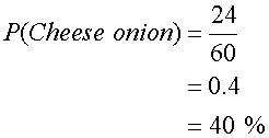
There is a 1.7% greater chance that Cheese & Onion would be picked as a flavour than Bigdog crisps would be picked as a brand.
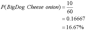
Example
What is the probability of a person choosing a packet of Cheese & Onion flavoured BigDog crisps ?
Normal Distribution Curve
AKA Bell Curve or Gaussian Curve
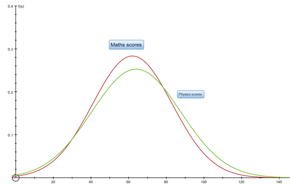
This is a symmetrical graph which is centered on the mean of the data.
The x axis shows data values, the y axis shows relative probability of the data data values occurring.
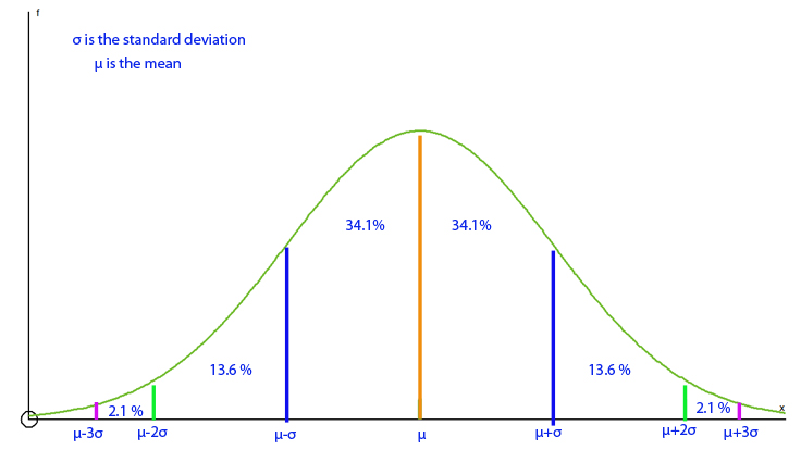
68-95-99.7 rule : Approximately 68% of the data will lie between the mean and 1 standard deviation away from the mean, 95% within two standard deviations and d 99.7% within three standard deviations.
The taller the peak, the smaller the standard deviation.
Example
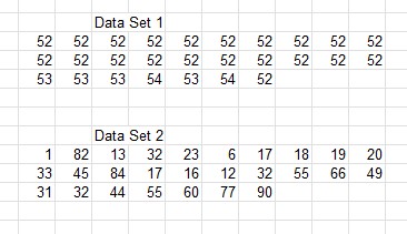
Data Set 1 has values that are very close together and don't vary much from the mean ( μ) , giving a low variation ( σ 2) and low standard deviation ( σ)
Data Set 1 μ = 52.3 (1dp) σ 2= 0.4 (1dp) and σ =0.6 (1dp)
Data Set 2 has values that are widely spread , giving a high standard deviation
Data Set 2 μ = 38.1 (1dp) σ 2= 625.2 (1dp) and σ =25.0 (1dp)
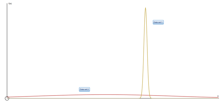
Data set 1 clearly has a taller peak and so a lower standard deviation than data set 2
Hypothesis Testing
Hypothesis testing draws conclusions about an entire population based on a representative sample.
H0 is the Null Hypothesis - this is usually a statement to show that no relationship , effect or difference exists between the two sets of data or variables being tested.
HA or H1 is the Alternative Hypothesis - this is usually a statement to test that a relationship , effect or difference exists between the two sets of data or variables being tested.
H0 and HA are mutually exclusive.
A result is statistically significant if it allows the null hypothesis to be rejected.
The p-value is the probability that a given result would occur under the null hypothesis. The lower the p-value is, the lower the probability of getting that result if the null hypothesis were true.
In a significance test, the null hypothesis is rejected if the p-value is less than or equal to a predefined threshold value which is referred to as the alpha level or significance level and is often set to 0.05 (5%)
Steps :
- State H0 and HA
- Collect approriate data
- Perform an appropriate statistical test
- Decide whether to reject or fail to reject H0
- Present findings in the results and discussion section of your report
Example
Using the data from the Line of Best Fit section above :
H0 : μ maths = μ physics
HA : μ maths ≠μ physics
Alpha value of 0.05 (5%)
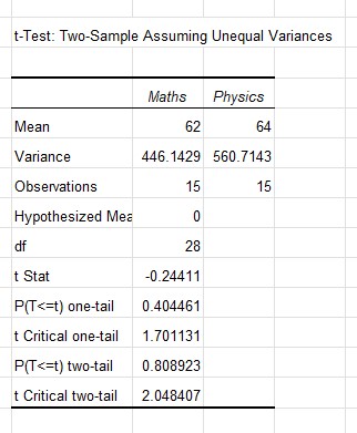
The test statistic, t, is -0.24411
The p value for the two tailed test is 0.808923
p > α and the absolute value of t is less than the t Critical two-tail test figure - so the null hypothesis is failed to be rejected and it is concluded that there is no significant difference between the means of the two groups - being good at maths does suggest being good at physics!
Confidence Intervals
Confidence levels - belief that a statistical result is true- are usually expressed as a percentage, often 95% or 99%. A confidence level of 95% means that we are 95% sure that the result is not due to chance or sampling error.
Confidence intervals - ranges of values that contain the true population parameter with a certain probability - depend on the sample size, the sample mean, the population standard deviation, and the chosen confidence level.
confidence interval = sample mean ± (critical value × standard error)
The critical value is a number that depends on the confidence level and the shape of the sampling distribution. The standard error is the standard deviation of the sampling distribution, which can be estimated by dividing the population standard deviation by the square root of the sample size.
The lower and upper bounds of the confidence interval indicate the range of values that are likely to contain the true population mean with a given confidence level.
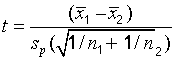
t - tests
A one sample t-test is used to test whether or not the mean of a population is equal to a particular value. The mean of a sample is used to to estimate the true population mean.
A one-sample t-test always uses the following null hypothesis:
H0 : μ = μ 0
The alternative hypothesis can be either two-tailed, left-tailed, or right-tailed:
- H A (two-tailed): μ ≠ μ 0
- HA (left-tailed): μ < μ 0
- HA (right-tailed): μ > μ 0
so
If the p-value that corresponds to the test statistic t with (n-1) degrees of freedom is less than the chosen significance level , α , the null hypothesis can be rejected.
A two sample t-test is used to determine whether or not two population means are equal.
A two-sample t-test always uses the following null hypothesis:
H0 : μ1 = μ 2
The alternative hypothesis can be either two-tailed, left-tailed, or right-tailed:
- H A (two-tailed): μ1 ≠ μ 2
- HA (left-tailed): μ1 < μ 2
- HA (right-tailed): μ1 > μ 2
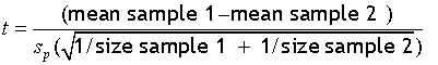
so
where the pooled standard deviation , sp , is
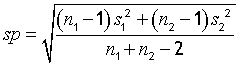
n1 is the count of sample 1, s2 is the count of sample 2
s1 is the standard deviation of sample 1, s2 is the standard deviation of sample 2
Paired t - tests
A paired t-test compares the means of two related groups of observations. It is used to test whether there is a significant difference between the average values of the two groups by comparing their measurements before and after the event. The paired t-test assumes that the observations are normally distributed, independent, and have equal variances within each group.
z - tests
A z-test compares the mean of a population or a sample to a hypothesized value. It assumes that the population variance is known and that the sample size is large enough to approximate a normal distribution, which can be used to calculate the p-value and determine whether to reject or fail to reject the null hypothesis. The p-value depends on the direction and type of the test (one-tailed or two-tailed). The Φ value is then the absolute value of the z-score, which represents the number of standard deviations away from the mean.
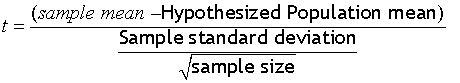
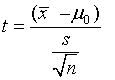
The formula for the z-test statistic is: z = (x - μ) / (σ / √n)
where x is the sample mean, μ is the hypothesized population mean, σ is the population standard deviation, and n is the sample size.
Example
suppose we want to test whether the average height of adult males in the UK is different from 175 cm, using a sample of 100 men with a mean height of 173 cm and a population standard deviation of 10 cm. We can use a two-tailed z-test with the following hypotheses:
H0: μ = 175
H1: μ ≠ 175
The z-test statistic is
z = (173 - 175) / (10 / √100) = -2
The p-value for a two-tailed test is: p = 2 * Φ(-|z|) = 2 * Φ(-2) ≈ 0.046 Since the p-value is less than 0.05, we can reject the null hypothesis and conclude that there is a significant difference between the sample mean and the hypothesized population mean.
Which test to use ?
- t - test if small sample ( n <30 ) or standard deviation not known
- z -test if large sample or standard deviation known
Terminology
μ is the population mean
σ is the standard deviation
r is the Pearson’s product-moment correlation coefficient
Φ, the phi coefficient, is a measure of association between two binary variables
Statistics using Excel
Excel can be used for calculating statistics.
Basic Statistics
Number of bits of data =COUNT( range to be counted)
Sum of data =SUM( range to be added)
Mean : =AVERAGE( range of data set)
Median =MEDIAN ( range of data set)
Mode =MODE.SNGL( range of data set)
5 Figure Summary
Highest, H =MAX( range to be counted)
Lowest, L =MIN( range to be added)
Lower Quartile, Q1
Using the formula =QUARTILE.INC(data set,1) can result in unexpected values, seemingly due to Excel calculating the quartiles as percentiles and not as medians of the upper/lower half of the data.
This formula, based on the Excel SMALL function appears to work :
=IF(ISEVEN(ROUNDDOWN(COUNT()/2,0)),AVERAGE(SMALL(range of dataset,ROUNDDOWN(COUNT(range of dataset)/2,0)/2),SMALL(range of dataset,ROUNDDOWN(COUNT(range of dataset)/2,0)/2+1)),SMALL(range of dataset,ROUNDUP(ROUNDDOWN(COUNT(range of dataset)/2,0)/2,0)))
Q2 =MEDIAN ( range of data set)
Upper Quartile , Q3 =QUARTILE.INC(data set,3)
This formula, based on the Excel LARGE function appears to work :
=IF(ISEVEN(ROUNDDOWN(COUNT(range of dataset)/2,0)),AVERAGE(LARGE(range of dataset,ROUNDDOWN(COUNT(range of dataset)/2,0)/2),LARGE(range of dataset,ROUNDDOWN(COUNT(range of dataset)/2,0)/2+1)),LARGE(range of dataset,ROUNDUP(ROUNDDOWN(COUNT(range of dataset)/2,0)/2,0)))
More
Range =Cell for H - Cell for L
Inter Quartile Range, IQR =Cell for Q3 - Cell for Q1
Semi interquartile range , SIQR =Cell for IQR / 2
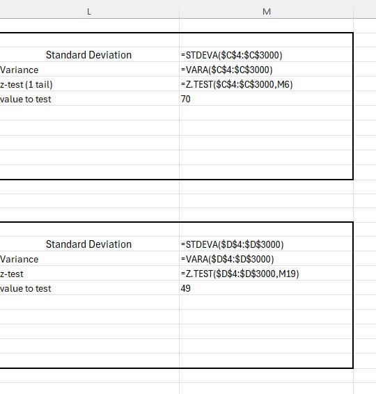
Standard Deviation =STDEVA(range of dataset)
Variance =VARA(range of dataset)
Z test (1 tail) =Z.TEST(range of data set, value to test)
Pearson =PEARSON(range of dataset 1, range of dataset 2)
Pearson =PEARSON(range of dataset 1, range of dataset 2)
t test ( 1 tail , paired ) =T.TEST(range of dataset 1, range of dataset 2 , 1, 1)
t test ( 2 tail , paired ) =T.TEST(range of dataset 1, range of dataset 2 , 2, 1)
t test ( 2 tail , equal variance ) =T.TEST(range of dataset 1, range of dataset 2 , 2, 2)
t test ( 2 tail ,unequal variance ) =T.TEST(range of dataset 1, range of dataset 2 , 2, 3)
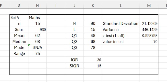
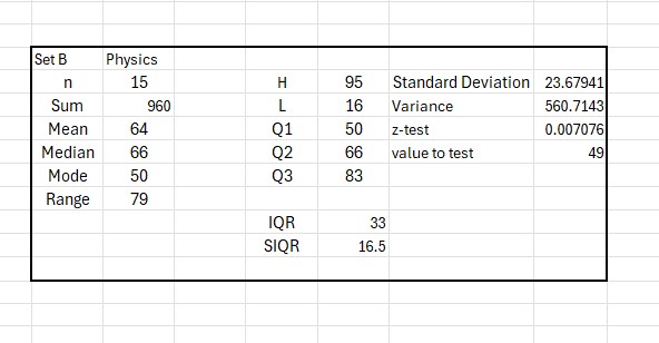
Example
Test scores for Maths and Physics tests are compared.
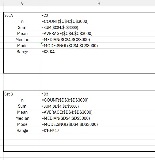
The spreadsheet has been set up with data set A in cells C4:C3000 and data set B in cells D4:D3000
Maths data has been entered into column C and Physics data in column D.
The summary of data for Maths
and for Physics
Using Show Formula

Formula
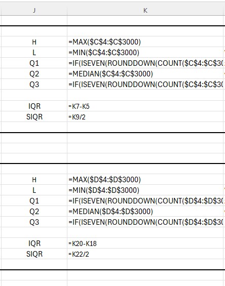
Q1 has formula
=IF(ISEVEN(ROUNDDOWN(COUNT($C$4:$C$3000)/2,0)),AVERAGE(SMALL($C$4:$C$3000,ROUNDDOWN(COUNT($C$4:$C$3000)/2,0)/2),SMALL($C$4:$C$3000,ROUNDDOWN(COUNT($C$4:$C$3000)/2,0)/2+1)),SMALL($C$4:$C$3000,ROUNDUP(ROUNDDOWN(COUNT($C$4:$C$3000)/2,0)/2,0)))
Q3 has formula
=IF(ISEVEN(ROUNDDOWN(COUNT($C$4:$C$3000)/2,0)),AVERAGE(LARGE($C$4:$C$3000,ROUNDDOWN(COUNT($C$4:$C$3000)/2,0)/2),LARGE($C$4:$C$3000,ROUNDDOWN(COUNT($C$4:$C$3000)/2,0)/2+1)),LARGE($C$4:$C$3000,ROUNDUP(ROUNDDOWN(COUNT($C$4:$C$3000)/2,0)/2,0)))


Mean, Median, Mode & Range Drill Questions
As an Amazon Associate I earn from qualifying purchases.
 © Alexander Forrest