Distance–Time Graphs
The distance travelled is plotted on the y‑axis, and the time period is plotted on the x‑axis.
Example
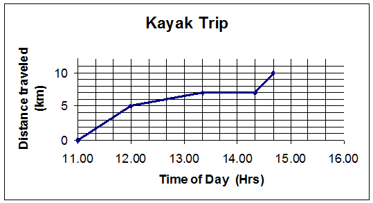
This graph shows the progress made by a sea kayaking group.
Each hour on the graph is split into three sections, each representing 20 minutes.
The group starts the trip at 11:00. By midday, they have travelled 5 km.
They then slow down and paddle until 13:20. They have now travelled 7 km and stop for lunch.
The group restarts at 14:20 and catch a current which allows them to cover 3 km in 20 minutes.
The gradient of each section of the journey gives the average speed for that part of the journey.