Bar charts
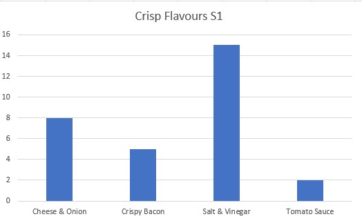
A bar chart is a way of visually representing categorical data.
The higher the bar , the greater the number of items in that category.
Bar charts have gaps between the categories.
Example
An S1 class was asked to vote for their favourite crisps from a selection of flavours.
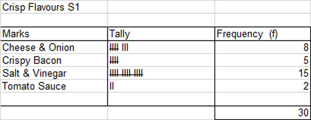
The bar chart shows that the order of preference was Salt and Vinegar, then Cheese and Onion , Crispy Bacon and Tomato Sauce.
 © Alexander Forrest